Kibana 4 Tutorial – Part 3: Visualize
This is part 3 of the Kibana 4 tutorial series. We assume you have completed at least the steps in Part 1 – Introduction.
Visualizations are the heart of Kibana 4. They are used to aggregate and visualize your data in different ways. To understand visualizations, we have to look at elasticsearch aggregations first, since they are the basis. If you are familiar with elasticsearchs aggregations, you can skip the next paragraphs.
Aggregations
The aggregation of our data is not done by Kibana, but by the underlying elasticsearch. We can distinguish two types of aggregations: bucket and metric aggregations. To get a good grip on visualizations with Kibana 4, it is essential to understand how those aggregations work, so don’t be discouraged by the wall of text coming up.
Bucket aggregations
A bucket aggregation groups all documents into several buckets, each containing a subset of the indexed documents. The decision which bucket to sort a specific document into can be based on the value of a specific field, a custom filter or other parameters. Currently, Kibana 4 supports 7 bucket aggregations, which will be described in the following paragraphs. For each aggregation an example for the sample twitter data is given. Later in this tutorial we will see some complete examples for several of them:
Date Histogram
The date histogram aggregation requires a field of type date and an interval. It will then put all the documents into one bucket, whose value of the specified date field lies within the same interval.
Example: You can construct a Date Histogram on the created_at field of all messages with the interval minute. In this case, there will be a bucket for each minute and each bucket will hold all messages that have been written in that minute.
Besides common interval values like minutes, hourly, daily, etc. there is the special value auto. When you select this interval, the actual time interval will be determined by Kibana depending on how large you want to draw this graph, so that a good amount of buckets will be created (no t too many to pollute the graph, nor too few so the graph would become irrelevant).
Histogram
A histogram is pretty much like a date histogram, except that you can use it on every number field. Same as with date histogram, you specify a number field and an interval (which in this case is any number). The aggregation then builds a bucket for each interval and puts in all documents, whose value falls inside this interval.
Example: An histogram on the field user.utc_offset (which holds the timezone offset from the UTC in seconds) with an interval of 3600, will create a bucket for each full timezone (UTC+1 hour, UTC+2 hours, and so on) and will put all the documents in there, whose user had the appropriate UTC offset. If you select a value of 1800 it will create a bucket for each 30 minutes timezone.
Range
The range aggregation is like a manual histogram aggregation. You also need to specify a field of type number, but you have to specify each interval manually. This is useful if you either want differently sized intervals or intervals that overlap.
Example: You could create a range aggregation on the field user.followers_count with the ranges 0-100, 100-1000 and 1000-*. That way you would get three buckets, containing the documents of users that have either 0-100, 100-1000 or 1000 followers and above. This could be useful to e.g. cluster twitter users by “success”.
Whenever you enter a range in Kibana, you can leave the upper or lower bound empty to create an open range (like the above 1000-*).
Terms
A terms aggregation creates buckets by the values of a field. This is much like a classical SQL GROUP BY. You specify a field (which can be of any type) and it will create a bucket for each of the values that exist in that field, and put all documents in that field that have the value.
Example: You can run a terms aggregation on the field user.country_code which holds the two letter country code of the user. After that you will have a bucket for each country code (jp, us, tr, ru, etc.) and in each bucket the documents of all users from that country.
The aggregation doesn’t always need to match the whole field value. If you let elasticsearch analyze a string field, it will by default split its value up by spaces, punctuation marks and the like, and each part will be an own term, and as such would get an own bucket. If you do a term aggregation on the text field (which contains the actual tweet), you might assume that you would get nearly one bucket per tweet, because two messages rarely are exactly the same. But this field is analyzed in our sample data, so you would get buckets for e.g. t.co, http, rt, and so on and in each of these buckets all documents, that had that term in the text field (even though it doesn’t need to match the text field exactly).
Elasticsearch can be configured not to analyze fields or you can configure the analyzer that is used to match the behavior of a terms aggregation to your actual needs. E.g. you could let the text field be analysed so that colons (:) and slashes (/) won’t be split separators. That way, an URL would be a single term and not split up into http, the domain, the ending and so on. More information on analyzers can be found in the elasticsearch documentation.
Filters
A filter aggregation is a completely flexible (but therefore maybe slower than the others) aggregation. You just specify a filter for each bucket and all documents, that match the filter will be in that bucket. Each filter is just a query as described in Part 2 of the tutorials in section Search for documents. The filter you specify for each bucket can be whatever you like, meaning there doesn’t need to be any relation between these filters (though most likely for a useful graph there is a connection between them).
Example: Create a filter aggregation with one query being “place.country_code:(tr or jp)” and the second filter being “user.follower_count:[1000 TO *]”. That way the aggregation creates two buckets, one containing all the tweets from turkey and japan, and one bucket with all the tweets of users with 1000 or more followers. It is up to you, to decide what kind of analysis you would do with these two buckets.. as already mentioned, completely unrelated queries in the filters aggregation rarely make sense. :-)
Significant Terms
The significant terms aggregation can be used to find “uncommonly common” terms in a set of documents (cf. Elasticsearch Guide). Given a subset of documents, this aggregation finds all the terms which appear in this subset more often than could be expected from term occurrences in the whole document set. It then builds a bucket for each of the significant terms which contains all documents of the subset in which this term appears. The size parameter controls how many buckets are constructed, i. e. how many significant terms are calculated.
The subset on which to operate the significant terms aggregation can be constructed by a filter or you can use another bucket aggregation first on all documents and then choose significant terms as a sub-aggregation which is computed for the documents in each bucket.
Example: We use the search field at the top to filter our documents for those with user.lang:en and then select significant terms as a bucket aggregation. The top 3 significant terms for this subset of documents are “to”, “the” and “you”.
Those terms are indeed more representative of English tweets than those we get when building a top three terms aggregation on the same subset of documents: “to.co”, “http” and “rt”. Although these terms appear in a lot of English tweets they are as often found in tweets with other user languages.
It could be interesting to filter our tweets by user language and then subdivide them further, for example by time zone or user name to see which terms are representative for a subgroup of all users with user.lang:en. For our purpose of getting to know Kibana and playing around with the visualizations the corresponding results would be adequate. Note however, that in order to deliver relevant results that really give insight into trends and anomalies in your data, the significant terms aggregation needs sufficiently sized subsets of documents to work on. And a further side note: That our significant terms don’t tell us much about the contents of the tweets has to do with the fact that we are looking for terms that are significant for English documents compared to documents in other languages. For this reason, we get terms which are very common in English texts, so-called stop words. In an all-English set of documents, if we built a subset and examined it for significant terms, those stop words would usually not even come near to being significant because they would appear in almost every document and thus would not be “uncommonly common” for any subset of the whole document collection.
Geohash
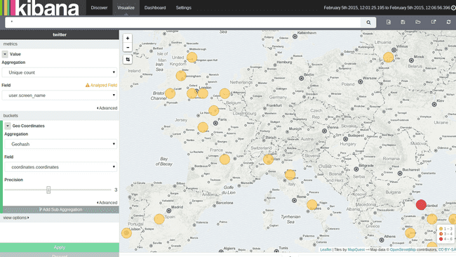
Elasticsearch can store coordinates in a special type geo_point field. That way the geohash aggregation can create buckets for values close to each other. You have to specify a field of type geo_point and a precision. The smaller the precision, the larger area the buckets will cover.
Example: You can create a geohash aggregation on the coordinates.coordinates field in the twitter data. This will create a bucket each containing tweets close to each other (how close [and therefor how many buckets you need for all data] will be specified by the precision.
Hint: This kind of aggregation makes mostly sense, if you use a Tile Map visualization (will be covered later). In all other aggregations you will just see a cryptic geohash string, which doesn’t make much sense, if not shown on a map.
Metric Aggregations
After you have run a bucket aggregation on your data, you will have several buckets with documents in them. You now specify one metric aggregation to calculate a single value for each bucket. The metric aggregation will be run on every bucket and result in one value per bucket.
In the visualizations the bucket aggregation usually will be used to determine the “first dimension” of the chart (e.g. for a pie chart, each bucket is one pie slice; for a bar chart each bucket will get it’s own bar). The value calculated by the metric aggregation will then be displayed as the “second dimension” (e.g. for a pie chart, the percentage it has in the whole pie; for a bar chart the actual high of the bar on the y-axis).
Since metric aggregations mostly makes sense, when they run on buckets, the examples of metric aggregations will always contain a bucket aggregation as a sample too. But of course you could also use the metric aggregation on any other bucket aggregation.. a bucket stays a bucket.
Count
This is not really an aggregation. It just returns the number of documents that are in each bucket as a value for that bucket. Sounds pretty simple, but is often enough for many kinds of analysis.
Example: If you want to know, how many tweets are from which country, you can use a term aggregation on the field place.country_code (which will create one bucket per country code) and afterwards run a count metric aggregation. Every country bucket will have the number of tweets as a result.
Average/Sum
For the average and sum aggregations you need to specify a numeric field. The result for each bucket will be the sum of all values in that field or the average of all values in that field respectively.
Example: You can have the same country buckets as above again and use a average aggregation on the user.followers_count field to get a result of how many followers does a twitter user in that country have in average.
Max/Min
Like the average and sum aggregation, this aggregation needs a numeric field to run on. It will return the minimum value or maximum value that can be found in any document in the bucket for that field.
Example: If we use the country buckets again and run a maximum aggregation on the retweet_count we would get for each country the highest amount of retweets a tweet had in the selected time period. (Notice: this won’t work in the sample data, since they are recorded from public stream, meaning they were put into elasticsearch straight when they have been written, where they obviously hadn’t had any retweets at that time.)
Unique count
The unique count will require a field and count how many different / unique values exist in documents for that bucket.
Example: This time we will use range buckets on the user.follower_count field, meaning we will have buckets for e.g. users with 1-100, 100-1000 and 1000- followers. If we now run a unique count aggregation on the place.country_code* field, we will get for each followers range the number of how many different countries users with so many followers would come. In the sample data that would show us, that there are users from 18 different countries with 1 to 100 followers, from 30 for 100 to 1000 followers and from 4 different countries for 1000 followers and above.
Percentiles
A percentiles aggregation is a bit different, since it won’t result in one value for each bucket, but in multiple values per bucket. These can be shown as e.g. different colored lines in a line graph.
When specifying a percentile aggregation you have to specify a number value field and multiple percentage values. The result of the aggregation will be the value for which the specified percentage of documents will be inside (lower) as this value. Confused? Let’s do this as an example:
You specify a percentiles aggregation on the field user.followers_count and specify the percentile values 1, 50 and 99. This will result in three aggregated values for each bucket. Let’s assume we have just one bucket with tweets in it (doesn’t matter where this bucket came from). The 1 percentile result (and e.g. the line in a line graph) will have the value 7. This means that 1% of all the tweets in this bucket have a followers count with 7 or below. The 50 percentile result is 276, meaning that 50% of all the tweets in this bucket have a followers count of 276 or below. The 99 percentile have a value of 17000, meaning that 99% of the tweets in the bucket have a followers count of 17000 or below.
If you want to read more on percentile aggregations, you can read the elasticsearch documentation.
Visualizations
Now that you’ve got an idea about what the available aggregations do, we will look at how to use them with visualizations. The different visualizations and what they do in short:
| Chart Type | Description |
|---|---|
| Area Chart | Displays a line chart with filled areas below the lines. The areas can be displayed stacked, overlapped, or some other variations. |
| Data Table | Displays a table of aggregated data. |
| Line Chart | Displays aggregated data as lines. |
| Markdown Widget | A simple widget, that can display some markdown text. Can be used to add help boxes or links to dashboards. |
| Metric | Displays one the result of a metric aggregation without buckets as a single large number. |
| Pie Chart | Displays data as a pie with different slices for each bucket or as a donut (depending on your taste). |
| Tile Map | Displays a map for results of a geohash aggregation. |
| Vertical bar chart | A chart with vertical bars for each bucket. |
Saving and Loading
While editing a visualization you will see the same New, Save and Load icons beside the search bar, as known from the Discover screen. The same rules apply there: When switching to another tab (e.g. Dashboard) and back again to the Visualize tab, Kibana will return to the very same visualization that you just edited. But unless you save this visualization it is not really persisted! So if you don’t want your visualization to be lost, always save it! This is easy to forget, especially once you saved it and edit it afterwards. These edits will be stored temporary when you switch tab, but they are not persisted at all in Kibana, unless you press save again.
Starting your first visualization
When you go to the Visualize tab, you will see a list of visualizations you can create and below a list of all saved visualizations, that you can open for editing.
Once you clicked a visualization type to create you have two options:
- From a new search
- From a saved search
You can use From a saved search to link a visualization to a query that you have save on the Discover page. If you don’t want to link it, just click From a new search to visualize on all of your data.
Sidenote: If you have added multiple indexes to your Kibana, you will be asked for which of the indexes you want to generate a visualization at this point. Unless you use From a new search in which case the visualization will be linked to the same index than the search.
In the following all the visualizations are described in detail with some example. The order is not alphabetically, but an order order that should be more intuitive to understand the visualizations.
A lot of the logic that applies to all charts will be explained in the Pie Charts section, so you should read this one before the others.
Pie chart
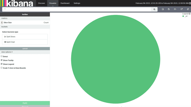
Once you selected the Pie Chart you will come to the visualization editor. This screen has a preview of your visualization on the right, and the edit options in the sidebar on the left.
The sidebar on the have always the two buttons on the bottom: Apply and Discard. In more recent Kibana versions these are now two icon buttons on top right of the panel. Apply is no a play icon and discard a cancel cross beside it. If you make changes in the editor, you have to press Apply to see them in the preview on the right side, or press Discard to throw them away and reset the editor to the state, that is currently shown in the preview (i.e. the last state you applied).
View options
Every visualization has the expandable view options where you can change some options about the visualization. For the pie chart there exist three different options:
Donut checks wjether or not the diagram should be displayed as a donut instead of a pie.
Show Tooltip exist on most of the visualizations and allow to enable or disable tooltips on the diagram. When they are enabled and the user hover over a slice of the pie chart (or bar in a bar diagram, etc.), a tooltip will appear showing some data about that slice, e.g. which field and value this belongs to and the value that the metrics aggregation calculated.
Show Legend will enable and disable the legend of the diagram. A legend appears as soon as there is more then one slice, bar, or similiar, and show what color belongs to which bucket.
Aggregations
Above the view options visualizations have the list of their bucket aggregations applied (as long as the visualization supports bucket aggregations). You can add a new bucket aggregation by pressing Add Aggregation in the buckets section.
Kibana asks you now to specify in which way the different buckets of these aggregations should be shown. A common option, that exists for most of the visualizations is the Split Chart option. That way each bucket that will be created by the bucket aggregation gets an own chart. All the charts will be placed beside and below each other and make up the whole visualization.
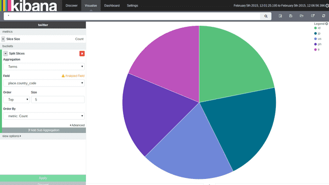
The other option for pie charts is Split Slices, which will generate a slice for each bucket. Let’s add a Split Slices type. Kibana now asks you for the aggregation and its parameters. Let’s say we want to see how the tweets distributed across countries. We will select a terms aggregation, select the field place.country_code and hit Apply.
The result should look like the screenshot on the right side. We got one pie slice per bucket (i.e. per country code). But how is the size of the slice in the pie determined? This will be done by the metric aggregation, which by default is set to Count of documents. So the pie now shows one slice per country bucket and its percentage depends on the amount of tweets, that came from this country.
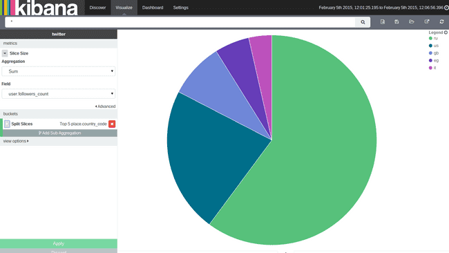
But, why are there only shown five slices? This is determined by the Order and Size option in the bucket aggregation. You can specify how many buckets you want to see in the diagram, and if you would like to see the ones with the least (bottom) or the highest (top) values. What might be a bit confusing is, that these order and size actually is linked to the metric aggregation on the top. To demonstrate this, we will switch the metric aggregation on the top. When you expand it you can switch the type to Sum and the field to user.followers_count. You will now get a slice for each country and its size will be determined, by the sum of the followers, that posted a tweet in our time range.
If you now select Top 5 not the same 4 countries will be shown anymore. Top 5 means, that it will now show the 5 countries, where this sum of followers is the highest. Beforehand it has shown the 5 countries, where the count of documents was the highest. So the order settings depends on the metric aggregation, that you have selected at the top of the editor. With the Order by select box you can also specify another metrics aggregation, that you want to use for ordering. Some graph types support multiple metric aggregations. If you add multiple metrics aggregations you will also be able to select in the order by box, which of these you want to use for ordering.
Let’s undo the changes again, so we use the document count, and the diagram looks again like the previous screenshot.
A lot of diagram can used nested bucketing, so does the pie chart. You can click the Add Sub Aggregation button to add another level of bucketing. You can not nest the different types how the chart should display this in any order you want. For example the pie chart will complain, if you try to add now a Split Chart type, because it would like to first split charts, then use the sub aggregation on each chart.
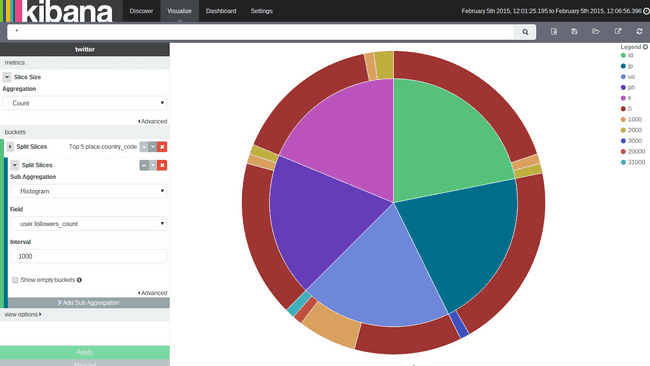
We will just add another Split Slices aggregation. Use a Histogram aggregation on the field user.followers_count with an interval size of 1000. The result should look like the screenshot on the right side. Adding a sub aggregation of type Split Slices will cause a second ring of slices around the first ring.
What does happen here? Kibana first aggregate via a terms aggregation on the country code field, so we have one bucket for each country code with all the tweets from that country in it. These buckets are shown as the inner pie and their size is determined by the selected metric aggregation (count of documents in each bucket).
Inside each bucket Kibana now use the nested aggregation to group by the followers count in a thousand interval. The result will be a bucket for each country code and inside each of these buckets, are buckets for each followers interval. The size of the inside buckets are again determined by the selected metric aggregation, meaning also the size of documents will be counted. In the pie chart you will see this nested aggregation as more slices in the second ring.
If you want to change the bucketing order, meaning in this case, you first want to bucket the tweets by their followers and then you want to have buckets inside these follower buckets for each country, you can just use the arrows beside the aggregation to move it to an outer or inner level.
There are some options to the Histogram aggregation. You can set if empty buckets (buckets in which interval no documents lie) should be shown. This doesn’t make any sense for pie charts, since they will just appear in the legend, but due to the nature of the pie chart, their slice will be 0% large, so you cannot see it. You can also set a limit for the minimum and maximum field value, that you want to use.
Before we look at the next type of visualization, we should save this one for later usage. Press the Save button on the top right and give your visualization a name. To create a new visualization just hit the new button beside the save button.
Tile Map
A tile map is most likely the only useful way to display a geohash aggregation. When you create a new one, you can again use the Split Chart to create one map per bucket, and the other option is the Geo coordinates type. That way you have to select a field that contains geo coordinates and a precision. The visualization will show a circle on the map for each bucket. The circle (and bucket) size depends on the precision you choose. The color of the circle will indicate the actual value calculated by the metric aggregation.
Area/Line Chart
The Area Chart and Line Chart are very similar, except for the Area Chart painting the area below the line, and so it supports different methods of overlapping and stacking for the different areas. Both kind of charts are often used to display data over time.
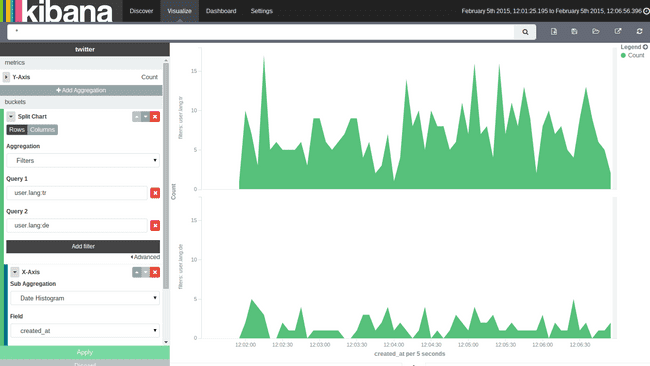
The chart that we want to create, should compare German speaking vs. Turkish speaking users in the way they have geo positions enabled. We want to split up the graph for the two languages.
First we add a new bucket aggregation with type Split Chart with a filters aggregation and one filter for user.lang:de and another for user.lang:tr. Then we add a sub aggregation of type X-Axis of type Date Histogram on the field created_at with an auto interval. As mentioned the x-axis will often be used to display a time value (so data will be displayed over time), but it is not limited to that. You can use any other aggregation if you like but take care, that the line (or area) will be interpolated between two points on the x-axis. Which doesn’t make much sense, if the values you choose aren’t anyhow consecutive.
After you have added those two visualizations the output should look like the screenshot on the right.
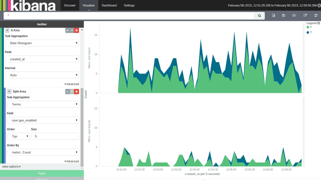
Add now another sub aggregation of type Split Area which will cause to create multiple colored areas in the graph. To check whether geo positions are enabled, we will do a terms aggregation on the field user.geo_enabled. Now you have a (or better two) graphs showing the tweets which has geo positions enabled and the one who doesn’t for the both languages German and Turkish.
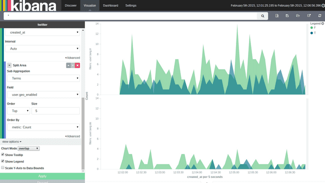
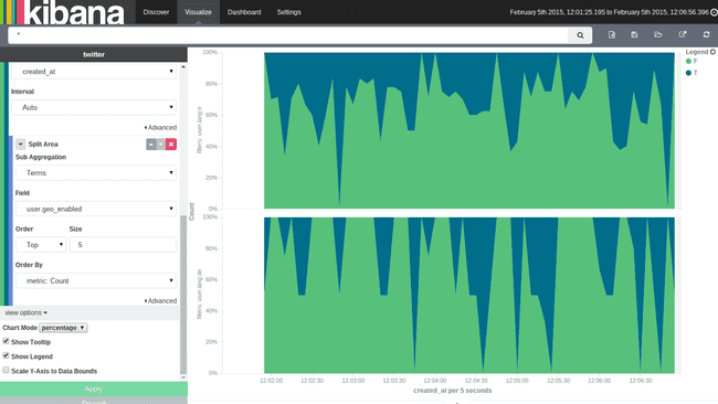
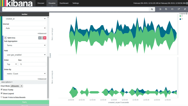
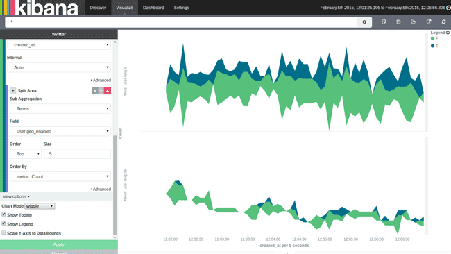
In the view options you can change the Chart Mode which is currently set to stacked. This option only applies to the area chart, since in a line chart there is no need for stacking or overlapping areas. For area charts there exist five different types of Chart Mode:
stacked
The area for each bucket will be stacked upon the area below. The total documents across all buckets can be directly seen from the height, of all stacked elements.
overlap
In the overlap view, areas won’t be stacked upon each other. Every area will begin at the x-axis and will be displayed semi-transparent, so all areas overlap each other. You can easily compare the values of the different buckets against each other that way, but it is harder to get the total value of all buckets in that mode.
percentage
The height of the chart will always be 100% for the whole x-axis and only the percentage between the different buckets will be shown.
silhouette
In this chart mode, a line somewhere in the middle of the diagram is chosen and all charts evolve from that line to both directions.
wiggle
This is much like the silhouette mode, but it doesn’t keep a static baseline from which the areas evolve in both directions. Instead it try to calculate the baseline for each value again, so that change in slope is minimized. If hardly ever found that useful in a diagram, since it makes seeing relations between area sizes and reading the total value more difficult than the other modes.
Multiple y-axises
Beside changing the view mode, you also have the possibility to add another metric aggregation to either line or area charts. That metric aggregation will be shown with its own color in the same diagrams. Unfortunately all metric aggregations you add, will share the same scale on the y-axis. That’s why this makes most sense, if your metric aggregations return values in the same dimension (e.g. one metric that will result in values from up to 100 and another that result in values from 1 million to 10 million, won’t be displayed very well, since the first metric will barely be visible in the graph).
Vertical Bar
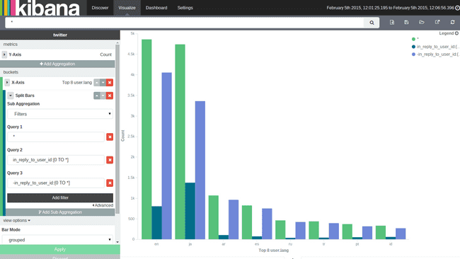
The vertical bar visualization is much like the area visualization, but more suited if the data on your x-axis isn’t consecutive, because each x-axis value will get it’s own bar(s) and there won’t be any interpolation done between the values of these bars.
You only have three bar modes available: stacked, which behave the same like in area chart, it just stack the bard onto each other. percentage use 100% height bars, and only shows the distribution between the different buckets. Grouped is the only different mode compared to area charts. It will place the bars for each x-axis value beside each other as shown in the screenshot on the right.
Metric
A metric visualization can just display the result of a metrics aggregation. There is no bucketing done. It will always apply to the whole data set, that is currently taken into account (you can change the data set by typing queries in the top box). The only view option, that exists is the font size of the displayed number.
Markdown widget
This is a very simple widget, which doesn’t do anything with your data. You only have the view options where you can specify some markdown. The markdown will be rendered in the visualization. This can be very useful to add help texts or links to other pages to your dashboards. The markdown you can enter is GitHub flavored markdown.
Data table
A data table is a tabular output of aggregation results. It’s basically the raw data, that in other visualizations would be rendered into some graphs. And as we will cover in the paragraph Debugging visualizations you can actually get the table of every visualization.
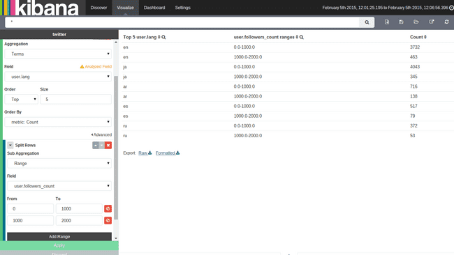
Let’s create a table that uses the Split Rows type to aggregate the top 5 user.lang terms. and a sub aggregation with some ranges on the user.followers_count field. In the screenshot on the right you can see what the aggregations should look like and the result of the table.
We will get all the language buckets on the top level. They will be presented in the first column of the table. Since each of these language buckets contains multiple buckets for the followers nested aggregation, there are multiple rows with the lang en, i.e. there is one row with en in the front for every bucket in the nested aggregation. The first three rows are all for the en language, and each row for one sub bucket of the nested aggregation. The result of the metrics aggregation will be shown in the last column. If you add another nested aggregation you will see, that those tables easily get pretty large and confusing.
If you would now like to see the result of the metrics aggregation for the terms aggregation on the language, you would have to sum up all the values in the last column, that belongs to rows beginning with en. This is some work to do, and wouldn’t work very well for average metrics aggregations for example. In the view options you can enable Show metrics for every bucket/level, which will show the result of the metrics aggregation after every column, for that level of aggregation. If you switch it on, after the en column should appear another column, which says something like 4874, meaning there are 4874 documents in the en bucket. This will be shown in every row, though it will always be the same for all rows with en in it. You can also set the size of how many rows should be shown in one page of the table in the view options.
Queries in visualizations
After we learned about all the visualizations there are just some small features we should talk about, before continuing to dashboards. Perhaps the most important one is queries in visualizations.
As you remember from the Discover tutorial, you can enter queries in a specific query language in the search box at the top of the page. This also works for visualizations. You can just enter any query there, and it will use this as a filter on the data, before the aggregation runs on the data. You can just try this out on our data table we generated in the last paragraph, by e.g. entering user.lang:pt to the search box and press enter. You will see that only rows with pt as the language will be shown.
This filtering is very handy, because it will be stored with the visualization when you save it, meaning if you place the visualization on a dashboard (see the next part of the tutorial series) the query that you stored with the visualization will still apply.
Debugging Visualizations
If you are more known to elasticsearch or interested in the raw data of your visualizations, it might come handy to take a deeper look into them. Kibana offers you some debugging output for your visualizations.
If you are in the Visualize screen, you can see a small up pointing arrow below the visualization preview (you will also see this on dashboards below the visualizations). Hitting this will reveal the debug panel with several tabs on the top.
Table
Will show the results of the aggregation as a data table visualization, i.e. it’s the raw data the way Kibana sees it.
Request
The request tab shows the raw JSON of the request, that has been sent to elasticsearch for this aggregation. This can get handy if you are common to elasticseach and its behavior.
Response
Shows the raw JSON response body, that elasticsearch returned for the request.
Statistics
Show some statistics about the call, like the duration of the request and the query, the amount of documents, that where hit, and the index that was queried.
What’s next?
After you have created lots of visualizations in this tutorial, it’s time to head over to part 4, where you will see how to use dashboards in Kibana 4.
